Cover
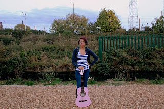
I will use this photo because it is nicely centred with enough space to add the artist's name and the album name if I need to. I also like the fact that there is a pink guitar in the shot, it adds a little more detail and character to our artist.
I will also use the same picture for my advertisement so that it relates back to the album itself and also because this particular picture has got a lot of space to insert text that advertise and promote the album.
Back
I will use this photo for my back cover because of the fact that it has enough space to put the song list to the right of her on the blank space available along with the record company's logo, copyright symbol and barcode without obstructing the artist.
Inside Panel 1
I will use this picture on the CD itself because of the way her hands and arms are positioned wrap perfectly around the CD. The relatively white background also contrasts with Hannah's clothes which make her clearly visible and there is also a space to the right for the album title.
Inside Panel 2
I will use this picture because it adds more variety to the pictures I want to use on the other panels. Because I have a long shot for my cover, a medium close up for my back panel, and a medium shot for the first inside panel therefore adding in an extreme close up was the next obvious choice.


No comments:
Post a Comment